Ground up rebuild · Spender mobile app
Ground up rebuild · Spender mobile app
Rebuilding the app where our users actually spend
Rebuilding the app where our users actually spend
The brief was "add the wow factor." Research said the app wasn't short on polish it was short on trust, and it was trying to serve two people with opposite jobs. I led the end-to-end rebuild of Alaan's Spender app: two role-shaped experiences, a scalable mobile design system, and interfaces designed to make people feel in control of their money in seconds.
The brief was "add the wow factor." Research said the app wasn't short on polish it was short on trust, and it was trying to serve two people with opposite jobs. I led the end-to-end rebuild of Alaan's Spender app: two role-shaped experiences, a scalable mobile design system, and interfaces designed to make people feel in control of their money in seconds.
SURFACE
iOS · Android · Spender app
DOMAIN
B2B2C · fintech · corporate spend
DOMAIN
B2B · Fintech · Accounting
ROLE
ROLE
Lead product Designer
Lead product Designer
TEAM
TEAM
Product · Engineering
Product · Engineering
SURFACE
SURFACE
iOS · Android · Spender app
iOS · Android · Spender app
DOMAIN
DOMAIN
B2B2C · fintech · corporate spend
B2B2C · fintech · corporate spend
DOMAIN
B2B · Fintech · Accounting
AT A GLANCE
AT A GLANCE
The Spender app is where the largest and least technical slice of Alaan's users live cardholders who open it for seconds at a time to check a balance, submit an expense, or approve a request on the move.
It had carried the product from 0 to 1, but it was functional, not world-class: visually dated, inconsistent screen to screen, and built without a system.
I led the ground-up rebuild and reframed it from a visual refresh into a redesign around how people actually use a spend app: quickly, interrupted, in high-stakes money moments, in two completely different roles.
The Spender app is where the largest and least technical slice of Alaan's users live cardholders who open it for seconds at a time to check a balance, submit an expense, or approve a request on the move.
It had carried the product from 0 to 1, but it was functional, not world-class: visually dated, inconsistent screen to screen, and built without a system.
I led the ground-up rebuild and reframed it from a visual refresh into a redesign around how people actually use a spend app: quickly, interrupted, in high-stakes money moments, in two completely different roles.
Trust in seconds
On a phone, in a money moment, confidence is earned fast through orientation, status and honest feedback, not decoration.
Designed for the real world
Empty states, errors, interruptions and recovery treated as the product not the edge case.
Built for two mental models
Built for two mental models
One app, forked by role. Spenders optimise for speed; admins for oversight. The rebuild stopped pretending they were the same user.
A system, not a skin
A system, not a skin
A scalable design system was the real deliverable tokens, components, patterns so quality could scale instead of decay.
Trust in seconds
Trust in seconds
On a phone, in a money moment, confidence is earned fast through orientation, status and honest feedback, not decoration.
Designed for the real world
Designed for the real world
Empty states, errors, interruptions and recovery treated as the product not the edge case.
PROBLEM DISCOVERY
PROBLEM DISCOVERY
An app that worked, but didn't earn Trust
An app that worked, but didn't earn Trust
I still remember the conversation with our CEO, Parthi, about how much the Spender app mattered. It's essentially a B2B2C product and for the person holding the card, the app is Alaan. His framing stuck with me: what got us from 0 to 1 won't get us from 1 to 10. Meeting industry standards was no longer the bar; world-class was. I asked for the space to lead it end-to-end, then flew to Dubai to sit close to real users and leadership.
The gap became clear fast. The old app was functional but dated, inconsistent from screen to screen, and quietly eroding trust in exactly the moment where trust matters most when someone is moving money. This wasn't a facelift waiting to happen. It was three problems tangled together.
I still remember the conversation with our CEO, Parthi, about how much the Spender app mattered. It's essentially a B2B2C product and for the person holding the card, the app is Alaan. His framing stuck with me: what got us from 0 to 1 won't get us from 1 to 10. Meeting industry standards was no longer the bar; world-class was. I asked for the space to lead it end-to-end, then flew to Dubai to sit close to real users and leadership.
The gap became clear fast. The old app was functional but dated, inconsistent from screen to screen, and quietly eroding trust in exactly the moment where trust matters most when someone is moving money. This wasn't a facelift waiting to happen. It was three problems tangled together.
Two users, one flow
Two users, one flow
Spenders and admins had opposite goals but the same generic experience, so neither felt purpose-built. The app served an average user who didn't exist.
Spenders and admins had opposite goals but the same generic experience, so neither felt purpose-built. The app served an average user who didn't exist.
Confidence gap
Confidence gap
In high-stakes, often irreversible actions, unclear status and thin feedback made users hesitate, re-check, or ask "did that even go through?"
In high-stakes, often irreversible actions, unclear status and thin feedback made users hesitate, re-check, or ask "did that even go through?"
Design debt
Design debt
With no system underneath, every screen drifted. The inconsistency is what read as "outdated" and untrustworthy far more than any single dated component.
With no system underneath, every screen drifted. The inconsistency is what read as "outdated" and untrustworthy far more than any single dated component.
Two people, two opposite jobs
Two people, two opposite jobs
The core structural flaw: the app treated everyone the same, even though the two dominant roles open it for almost opposite reasons.
The core structural flaw: the app treated everyone the same, even though the two dominant roles open it for almost opposite reasons.

NO CONFIRMATION
NO CONFIRMATION
"I submit an expense and then re-check it three times. There's no clear 'done' so I never actually trust that it went through."
"I submit an expense and then re-check it three times. There's no clear 'done' so I never actually trust that it went through."
EFFORT & WAITING
EFFORT & WAITING
"Filing one receipt is a five-step detour, and after all that I'm still guessing when I'll get my money back."
"Filing one receipt is a five-step detour, and after all that I'm still guessing when I'll get my money back."

BURIED OVERSIGHT
"I've got over a hundred approvals stacked up and I find the ones that matter by scrolling.”
ALWAYS TOO LATE
"By the time a policy breach shows up, the money's already spent. The app tells me what happened, never what's happening."
RESEARCH & VALIDATION
RESEARCH & VALIDATION
I looked for where trust broke,
not just where the UI looked old
I looked for where trust broke,
not just where the UI looked old
A dated look is a symptom. To rebuild rather than repaint, I grounded the redesign in real usage and real constraints, combining methods that each answered a different question separating surface friction from genuine loss of confidence.
A dated look is a symptom. To rebuild rather than repaint, I grounded the redesign in real usage and real constraints, combining methods that each answered a different question separating surface friction from genuine loss of confidence.
User interviews
Where do people lose control?
Where do people lose control?
1:1s with spenders and admins across roles and geographies to surface friction, hesitation, and the moments trust slipped.
1:1s with spenders and admins across roles and geographies to surface friction, hesitation, and the moments trust slipped.
Usage & product data
Where do tasks stall?
Where do tasks stall?
Behavioural data on where everyday spending workflows slowed, got abandoned, or looped back on themselves.
Behavioural data on where everyday spending workflows slowed, got abandoned, or looped back on themselves.
Competitor audit
How do the best make it feel light?
How do the best make it feel light?
Teardowns of consumer-grade fintech to see how heavy, high-stakes actions are made to feel effortless and safe.
Teardowns of consumer-grade fintech to see how heavy, high-stakes actions are made to feel effortless and safe.
Stakeholder & support input
What breaks at scale?
What breaks at scale?
Support patterns and leadership input on what the app had to carry as the user base and feature set grew.
Support patterns and leadership input on what the app had to carry as the user base and feature set grew.
Research Report
Research Report
View Full Report

Research Synthesis
Research Synthesis
The reframe: the app wasn't losing people because it was ugly. It was losing them because it didn't help them feel sure and because it forced two very different people down one road. Polishing screens would have refined the wrong thing. Five patterns held across every method.
The reframe: the app wasn't losing people because it was ugly. It was losing them because it didn't help them feel sure and because it forced two very different people down one road. Polishing screens would have refined the wrong thing. Five patterns held across every method.
The problem was trust, not polish: Users needed to feel oriented, in control and confident within the first few seconds not impressed.
The problem was trust, not polish: Users needed to feel oriented, in control and confident within the first few seconds not impressed.
One experience can't serve two mental models: Spenders and admins optimise for opposite outcomes; a single generic flow shortchanged both.
One experience can't serve two mental models: Spenders and admins optimise for opposite outcomes; a single generic flow shortchanged both.
Clarity beats cleverness: Reducing visual noise and hierarchy load did more for confidence than any amount of added flourish.
Clarity beats cleverness: Reducing visual noise and hierarchy load did more for confidence than any amount of added flourish.
The unglamorous states carry the trust: Microcopy, empty states and error handling shaped confidence in high-stakes flows more than the hero screens did.
The unglamorous states carry the trust: Microcopy, empty states and error handling shaped confidence in high-stakes flows more than the hero screens did.
Without a system, quality decays: Inconsistency was the root cause of "outdated" so the real fix was foundational, not cosmetic.
Without a system, quality decays: Inconsistency was the root cause of "outdated" so the real fix was foundational, not cosmetic.
Framing the real problem
Framing the real problem
The brief asked for a better-looking app. Research pointed somewhere deeper.
The brief asked for a better-looking app. Research pointed somewhere deeper.
The brief
Add the wow factor
The app looks outdated
Modernise the UI
Make it feel world-class
Add the wow factor
The app looks outdated
Modernise the UI
Make it feel world-class
What I found
Trust runs out before polish does
One app can't serve two roles
"Outdated" is a systems problem, not a skin
Confidence in money moments is the real bar
Trust runs out before polish does
One app can't serve two roles
"Outdated" is a systems problem, not a skin
Confidence in money moments is the real bar
THE REFRAME
THE REFRAME
How might we make every cardholder and admin feel oriented, in control and confident
with their money in seconds, on a phone, in the real world?
How might we make every cardholder and admin feel oriented, in control and confident with their money in seconds, on a phone, in the real world?
How might we make every cardholder and admin feel oriented, in control and confident with their money in seconds, on a phone, in the real world?
SOLUTIONING
SOLUTIONING
I studied how consumer fintech makes heavy actions feel light
I studied how consumer fintech makes heavy actions feel light
Before designing anything, I benchmarked best-in-class consumer and fintech apps to see how they carry dense capability on a small screen without overwhelming people. The goal was to extract the principles that reliably build confidence then turn each one into an architectural move, so the system is evidence-derived, not invented.
Before designing anything, I benchmarked best-in-class consumer and fintech apps to see how they carry dense capability on a small screen without overwhelming people. The goal was to extract the principles that reliably build confidence then turn each one into an architectural move, so the system is evidence-derived, not invented.


The principles that became the architecture
The principles that became the architecture
Four principles held across the field. They aren't decoration each turns directly into an architectural move below, so the system traces back to evidence.
Four principles held across the field. They aren't decoration each turns directly into an architectural move below, so the system traces back to evidence.
Disclose power progressively; keep the surface quiet.
Disclose power progressively; keep the surface quiet.
Always show state and the next step, especially with money.
Always show state and the next step, especially with money.
Remove friction and jargon; make the intimidating feel inviting.
Remove friction and jargon; make the intimidating feel inviting.
Strategy
Strategy
Rebuild as a system. Fork by role. Design for trust.
Rebuild as a system. Fork by role. Design for trust.
The old app was one generic flow, skinned once and left to drift. Four architectural moves replaced it with something that could scale and that treated its two audiences as the two audiences they are.
The old app was one generic flow, skinned once and left to drift. Four architectural moves replaced it with something that could scale and that treated its two audiences as the two audiences they are.
A shared foundation: Authentication, KYC, and the design system forks into two role-shaped experiences, bridged by a role switch for people who wear both hats. The structure encodes the core insight: don't average two users, serve each one.
A shared foundation: Authentication, KYC, and the design system forks into two role-shaped experiences, bridged by a role switch for people who wear both hats. The structure encodes the core insight: don't average two users, serve each one.

DESIGN & RATIONALE
DESIGN & RATIONALE
ONBOARDING & FIRST RUN
ONBOARDING & FIRST RUN
Orient before asking for effort
First-run showed value and set expectations before requesting a single input so a new cardholder understood what the app does for them before being asked to work. Motivation before mechanics.
First-run showed value and set expectations before requesting a single input so a new cardholder understood what the app does for them before being asked to work. Motivation before mechanics.

AUTH & KYC
AUTH & KYC
Make the highest-stakes first step feel guided and safe
KYC is a compliance-heavy wall that can sink a first impression. Broken into structured steps with clear progression, inline validation and reassurance, it became something manageable rather than intimidating and cut errors before they became support tickets.
KYC is a compliance-heavy wall that can sink a first impression. Broken into structured steps with clear progression, inline validation and reassurance, it became something manageable rather than intimidating and cut errors before they became support tickets.

SPENDER HOME & EXPENSE SUBMISSION
SPENDER HOME & EXPENSE SUBMISSION
Glanceable in second, stripped to its shortest safe path
The spender home was rebuilt around a single glance balance up top, the most frequent action one tap away, and status legible without digging. One primary task per screen, so a user mid-taxi-ride gets what they came for and leaves.
Submission is the action spenders repeat most, so every removed step compounds. Fewer inputs, smart defaults, and an unmistakable success confirmation because "did it go through?" is the anxiety that drives re-checks and tickets.
The spender home was rebuilt around a single glance balance up top, the most frequent action one tap away, and status legible without digging. One primary task per screen, so a user mid-taxi-ride gets what they came for and leaves.
Submission is the action spenders repeat most, so every removed step compounds. Fewer inputs, smart defaults, and an unmistakable success confirmation because "did it go through?" is the anxiety that drives re-checks and tickets.

CARDS & CONTROLS
CARDS & CONTROLS
Control over spending, with friction where it belongs
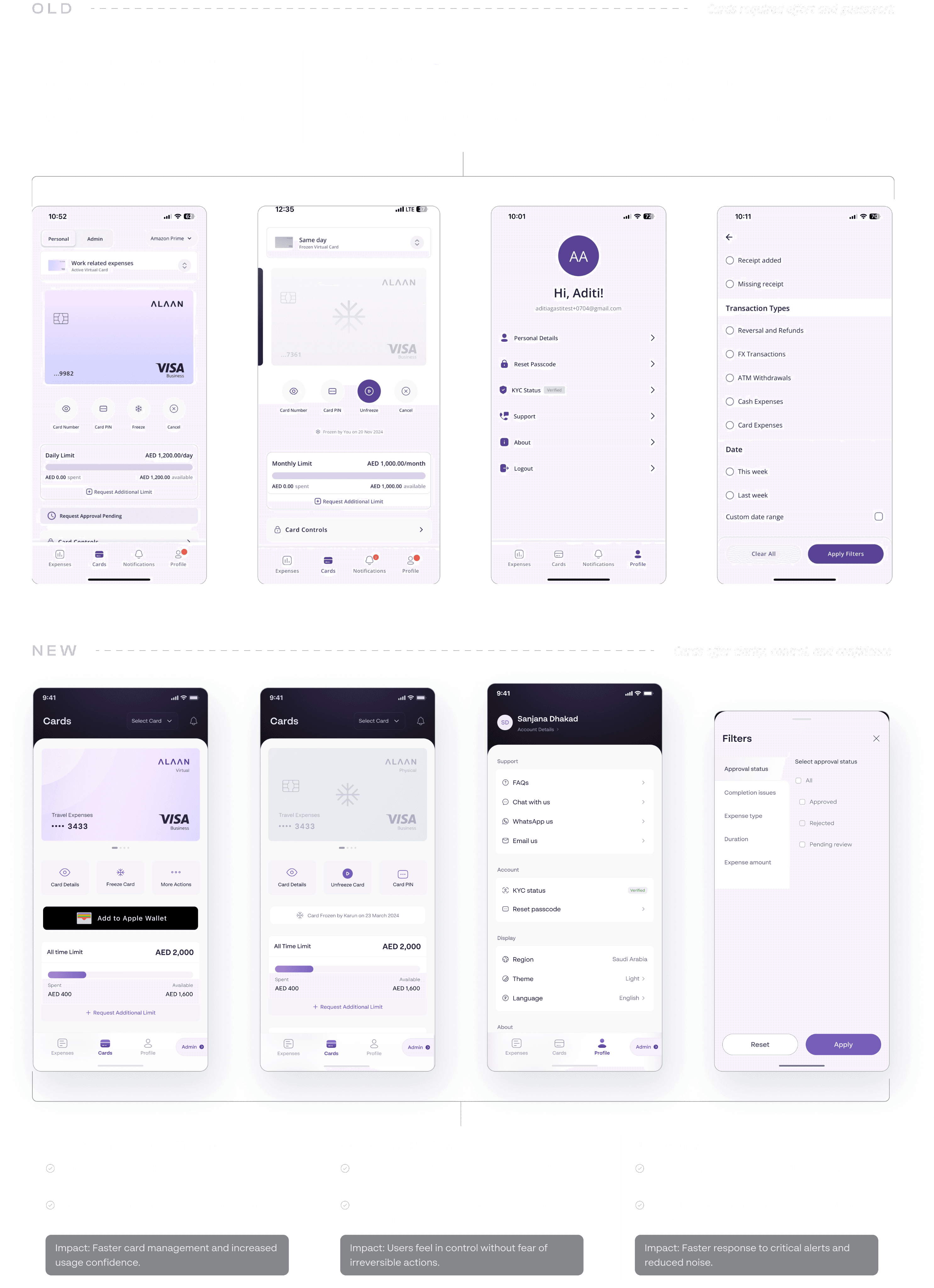
Freeze, limits, and card details gave spenders genuine control with intentional friction added only on irreversible actions, so a destructive tap is never a slip.
Freeze, limits, and card details gave spenders genuine control with intentional friction added only on irreversible actions, so a destructive tap is never a slip.
ADMIN · APPROVALS & EXCEPTIONS & ROLE SWITCH
ADMIN · APPROVALS & EXCEPTIONS & ROLE SWITCH
Oversight at a glance surface what needs a human, clear the rest
The admin surface inverts the spender's priorities: it leads with what's waiting and what's off. Approvals batch cleanly; exceptions are pushed up rather than buried, so a manager keeps control between meetings.
The admin surface inverts the spender's priorities: it leads with what's waiting and what's off. Approvals batch cleanly; exceptions are pushed up rather than buried, so a manager keeps control between meetings.
Many users are both spender and approver. The role switch lets them move between the two experiences deliberately, without re-authenticating or losing where they were the seam that makes the fork feel like one coherent app.
Many users are both spender and approver. The role switch lets them move between the two experiences deliberately, without re-authenticating or losing where they were the seam that makes the fork feel like one coherent app.

Edge cases & recovery
The happy path is the trailer. The real work is everything that goes sideways.
KYC rejection / document retry
Expired session / re-auth
Failed submission (offline / retry)
Approval on a stale item
Failed submission (offline / retry)
Approval on a stale item
Card action failure
No expenses / no approvals (empty)
Interrupted flow, resume on return
Role / permission change mid-session
Interrupted flow, resume on return
Role / permission change mid-session
Network loss on the move
Validation & conflicting-input states
Designing for Trust & Security
Designing for Trust and security
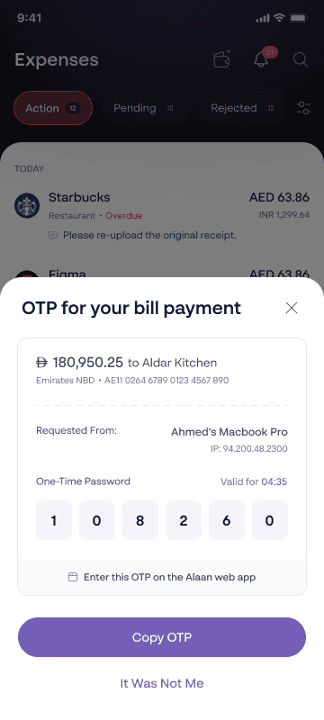
The rule that shaped every flow, edge case and UI. A state you can't understand is a state you don't trust and in a spend product, distrust isn't just frustration, it's doubt about your own money. So every failure resolves into something legible and actionable: what happened, why, and the one thing to do next. Designing these unglamorous states, not the hero flow, is what earns the right to be the app people reach for at a counter.
The rule that shaped every flow, edge case and UI. A state you can't understand is a state you don't trust and in a spend product, distrust isn't just frustration, it's doubt about your own money. So every failure resolves into something legible and actionable: what happened, why, and the one thing to do next. Designing these unglamorous states, not the hero flow, is what earns the right to be the app people reach for at a counter.




OUTCOMES
From an app that worked to one people trust & love
From an app that worked to one people trust & love
Reskinned symptoms
One generic flow for everyone
Screens drift, debt accumulates
Status left implicit
Happy path only
Reskinned symptoms
One generic flow for everyone
Screens drift, debt accumulates
Status left implicit
Happy path only
Rebuilt foundation
Two role-shaped experiences
A system keeps quality consistent
System status made visible
Errors, empties & recovery designed in
Rebuilt foundation
Two role-shaped experiences
A system keeps quality consistent
System status made visible
Errors, empties & recovery designed in
Faster
core task completion
Quicker key tasks
Submission and approval the highest-frequency actions completed noticeably faster.
"10×"
qualitative sentiment
Loved by users
Feedback described the rebuilt app as dramatically better than its predecessor.
~45–50%
mobile-related support tickets
mobile-related support tickets
Reduced support load
Fewer mobile queries as flows became self-evident and states self-explaining.
Fewer mobile queries as flows became self-evident and states self-explaining.
DATA
↑Adoption
spenders & approvers
spenders & approvers
Higher usage across both roles after the role-shaped rebuild shipped.
Higher usage across both roles after the role-shaped rebuild shipped.
Faster
core task completion
core task completion
Submission and approval the highest-frequency actions completed noticeably faster.
Submission and approval the highest-frequency actions completed noticeably faster.
"10×"
qualitative sentiment
qualitative sentiment
Feedback described the rebuilt app as dramatically better than its predecessor.
Feedback described the rebuilt app as dramatically better than its predecessor.
The rebuild shifted the app from a skin to a system
The rebuild shifted the app from a skin to a system
Before: reskinned symptoms. After: rebuilt foundation. Two role-shaped experiences, a system that keeps quality consistent, status made visible, and errors, empties & recovery designed in.
Before: reskinned symptoms. After: rebuilt foundation. Two role-shaped experiences, a system that keeps quality consistent, status made visible, and errors, empties & recovery designed in.
REFLECTION
I stopped designing screens and started designing a system
people could trust.
I stopped designing screens and started designing a system
people could trust.
The temptation was to make the app beautiful. The real work was making it trustworthy building the system that keeps it consistent, forking the experience so each role feels understood, and treating the error and the empty state as seriously as the hero screen.
On a phone, in a money moment, trust is the product. What got us from 0 to 1 was a working app. What moves toward 10 is one people feel sure of in seconds, in the real world, wherever they happen to be spending.
The temptation was to make the app beautiful. The real work was making it trustworthy building the system that keeps it consistent, forking the experience so each role feels understood, and treating the error and the empty state as seriously as the hero screen.
On a phone, in a money moment, trust is the product. What got us from 0 to 1 was a working app. What moves toward 10 is one people feel sure of in seconds, in the real world, wherever they happen to be spending.
That's a wrap. Thank you
OTHER CASE STUDIES
OTHER CASE STUDIES